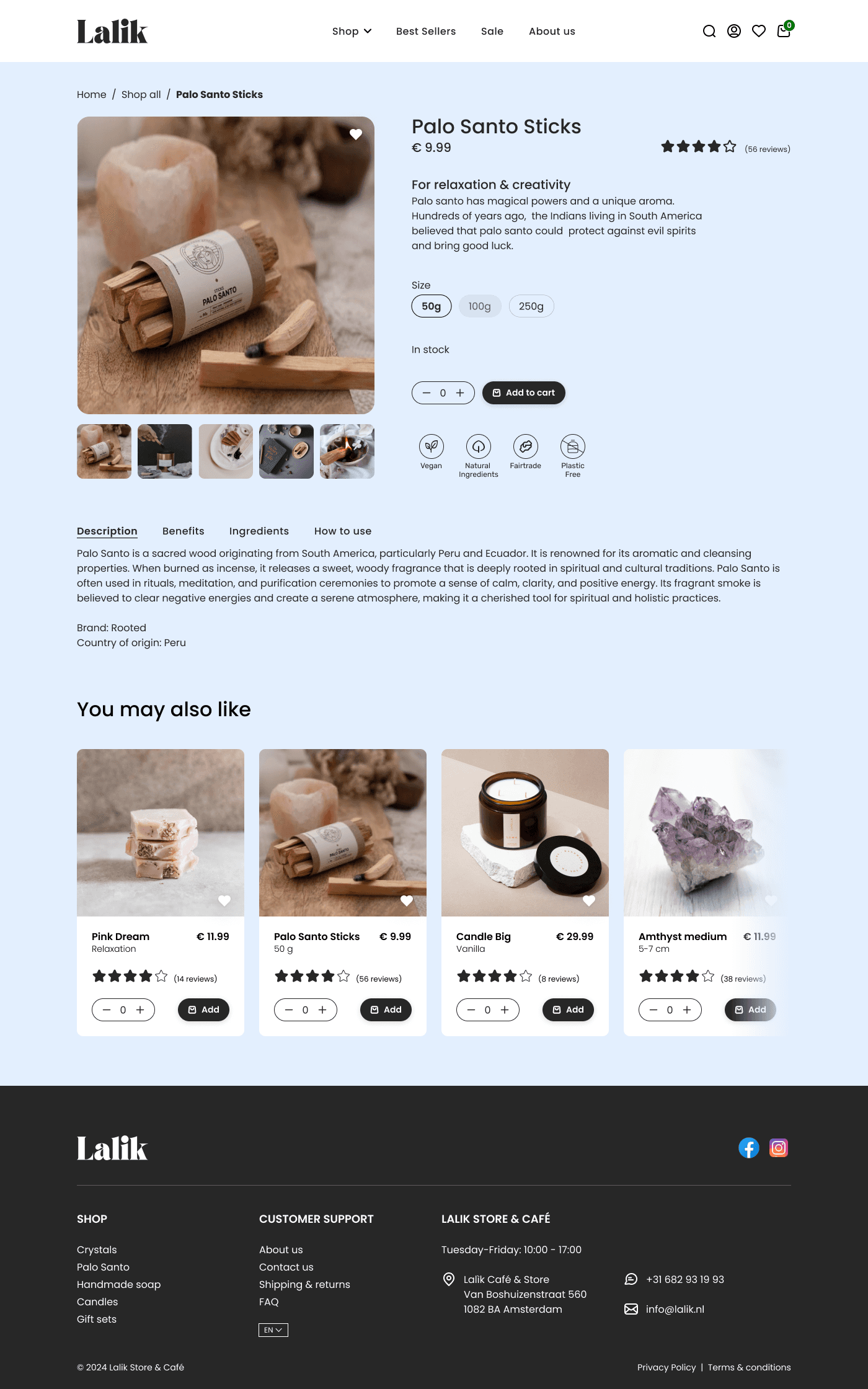
Lalik, a captivating self-care store in Amsterdam, curates a special selection of products like gemstones and Palo Santo, each with its own enchanting quality.
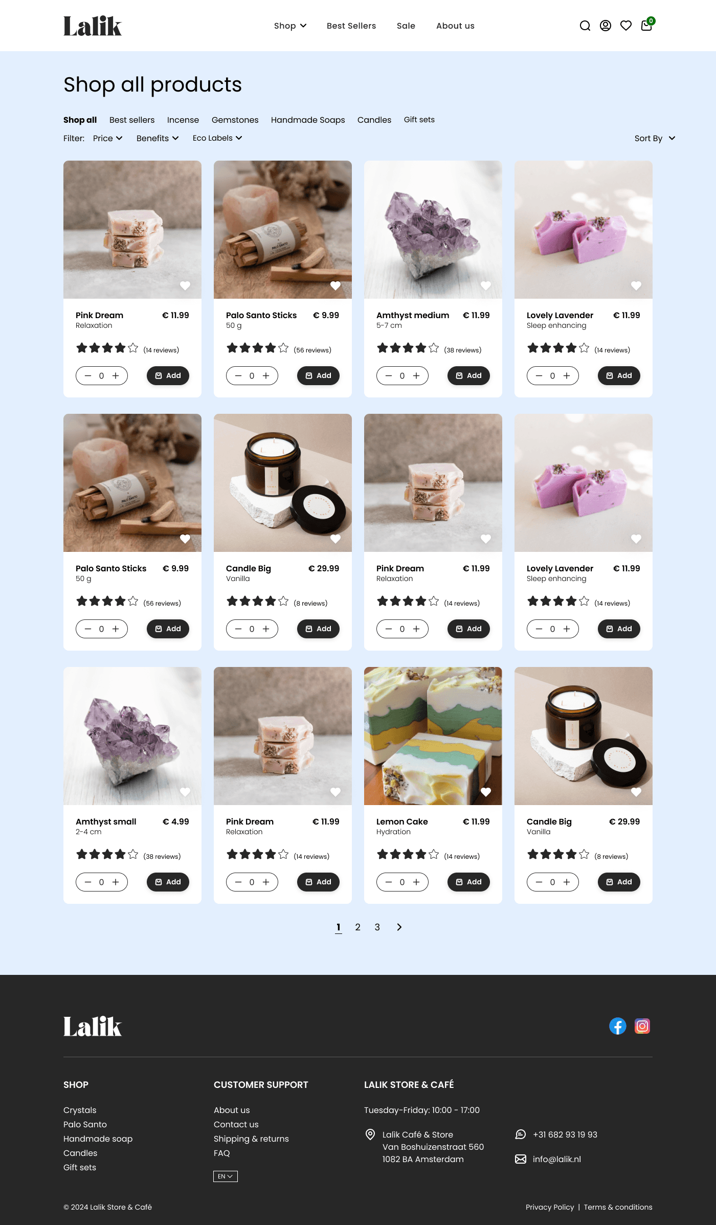
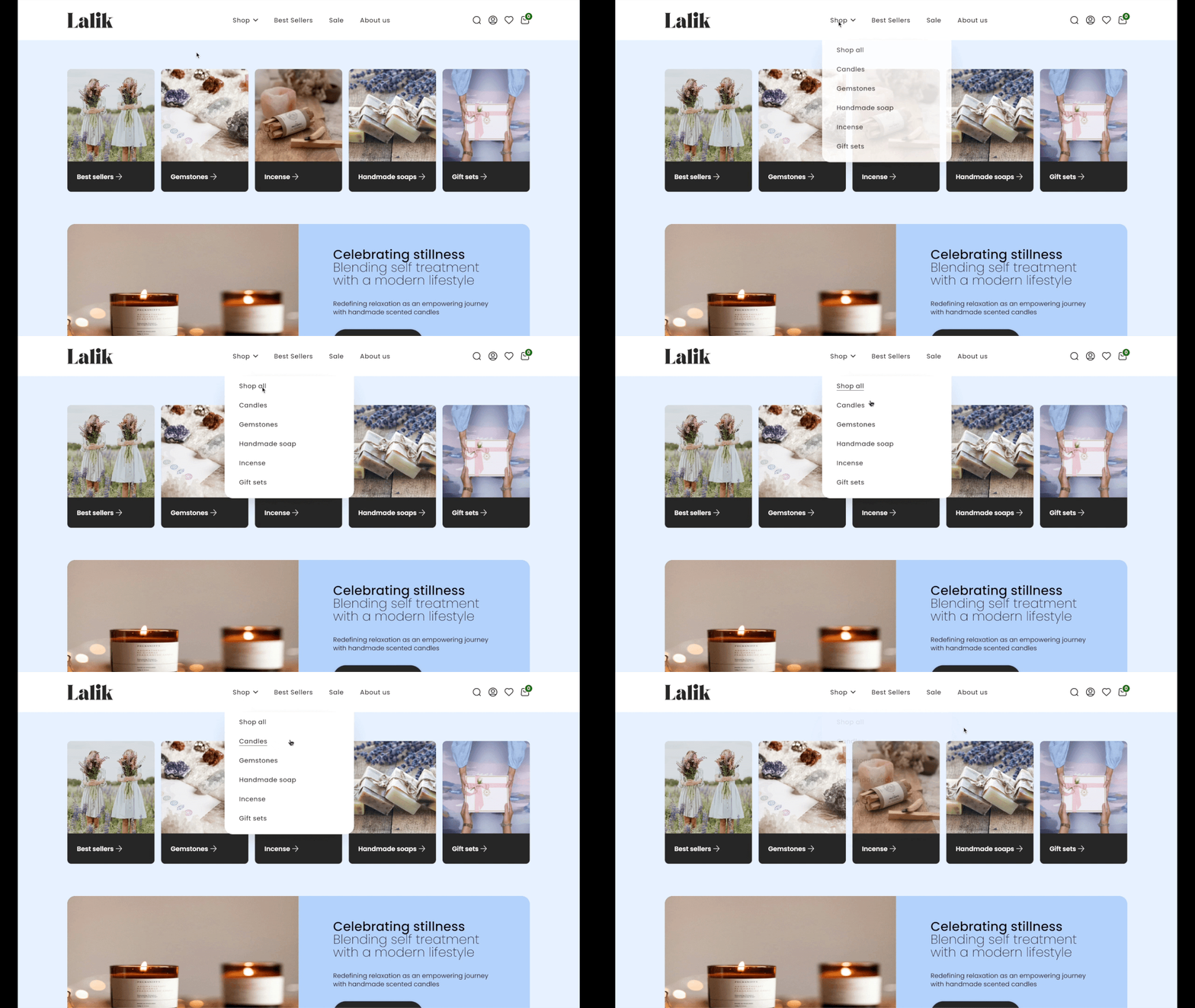
I was tasked of translating Lalik's in-store experience into an e-commerce webshop. Aiming to broaden it's market reach and create a digital space that captivates visitors, inviting them to explore and purchase with ease.
The challenge resulted in a magical, yet elegantly simple webshop that attracts customers with its charm and ensures a seamless checkout experience - a crucial element in driving sales and fostering customer loyalty.
MY ROLE
Research
UX/UI Design
Testing
TIMELINE
4 weeks
TOOLS
Figma
RESEARCH METHODS
Stakeholder Research
Competitive Analysis
Quantitative Research
Usability Testing
COMPANY
Lalik Café & Store
User Research
The user research results are based on a survey to provide quantitative data:
70%
65%
60%
70%
Add-to-Cart Overlay
Thorough attention was given to the Add-to-Cart design in order to tackle issues identified through user research. Creating an overlay cart can offer several benefits:
Efficient Product Management
Users can quickly adjust items without redirection, streamlining the process.
Enhanced User Control
Features like real-time updates empower users to manage their cart confidently.
Improved Conversion Rates
Overlay carts simplify checkout, leading to higher conversion rates.
Seamless Shopping Experience
Managing cart without leaving the page, ensuring uninterrupted shopping.
Checkout Flow
Based on user research I included the following in the checkout flow:
Overview
Ensures transparency, allows users to verify their selections, enhancing trust and reducing errors during checkout.
Progress bar
Helps users understand where they are + gives them sense of control and navigate with ease.
Multiple payment options
Caters to the diverse preferences and captures a wider range of customers.
Purchase confirmation
To reassure users that their order has been successful.
By focusing on creating a seamless and fast checkout experience, it not only makes it easier for users to complete their purchases but also increases the likelihood that they will return in the future. This can lead to higher customer satisfaction and more repeat purchases.
Conclusion
The insights from the quantitative research and the feedback gathered through user/usability testing greatly contributed to the creation of Lalik's e-commerce website.
While the e-commerce website didn't launch, to track success and impact,
I would monitor the following in order to track and improve results.
#1 Conversion rate
Track the percentage of website visitors who actually purchase products.
#2 User engagement
Measure page views, time and duration users spend on the website, and analyse which products are saved for how long.
#3 Sales revenue
Monitor the total income, type of sold products and repeated purchases.
#4 Customer feedback
Gather comments, reviews, and ratings from customers to understand their satisfaction levels, identify areas to enhance the user experience and sales.
YEAR
2023/24
RESEARCH TEAM
Kathy Shahwaladi


